
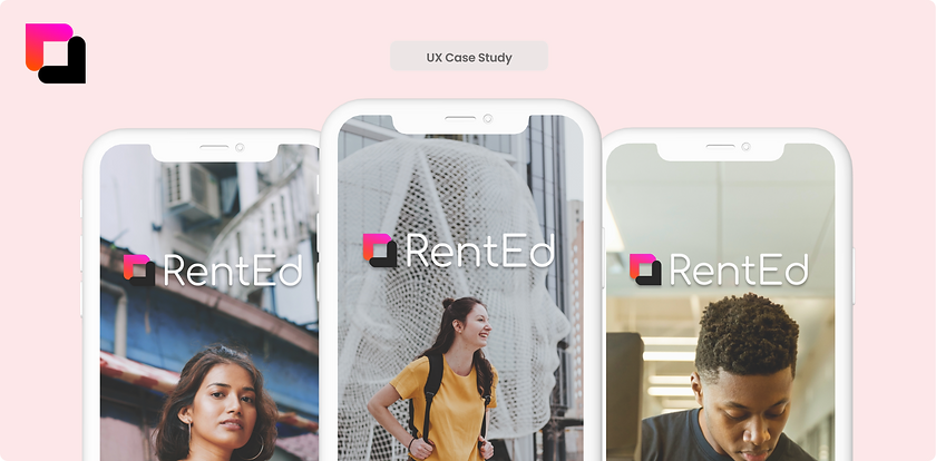
UX Case Study
Housing app that helps college students connect with sub-leasers across the nation to find secure, off-campus housing.
Project Context
In Fall 2021, four Franklin and Marshall (F&M) students joined together to create a team for F&M’s Incubator Program. I was one of these students. Together, we were a team of software engineers, UX designers, and product managers. RentEd’s mission is to create a community where college students across the nation can find affordable, off-campus housing during the off seasons.
Timeline:
September 2021 - Present
(in-progress)
Location:
Franklin and Marshall College, Lancaster, PA
Role:
1. Visual Design
2. Prototyping
3. Research
Tools:
Figma
Introduction
Problem: Finding housing has been difficult for students because of the limited and costly options.
Challenge: To identify the major challenges students have with finding housing during the off-season and design a digital solution that could assist college students with finding housing.
The Solution
So, RentEd was designed to be a platform that will connect students with sub-leasers across the nation to access long-term housing.
Design an Interactive Application
When thinking of designs, we wanted the process to be simple, fast, and easy for students to use on both ends of the subletting process. We focused on having a login screen that would request a school email for inclusiveness, and to also keep out potential scammers/manage a close-knitted community within the app.
We wanted to show as many listing possibilities and decided that allowing users to search by City/State and Name of University/College would make the searching process as accessible as possible. For viewing listings, it was important to incorporate a "slide to view more" image carousel, with descriptons of both the subletter and home description be avaiable below for students to view to see available utilities and other nearby resources.
And most importantly, booking! We wanted to design a booking system that was very easy for students to find, use, and secure their stay.
The Process
User Research
At the start of our customer discovery process, we wanted to make sure that other local students had these problems, because our problem was found through personal experiences. To better understand potential pain points of students when looking for housing during the off-season, we conducted 20 interviews with Franklin and Marshall students and found multiple root problems to synthesize from our gathered information. We were able to solidify the fact that students did find it difficult to find housing, and began planning our potential solution through affinity mapping and user journeys.
Our user research showed us that many students found it difficult to find housing because:
-
Lack of Housing Platforms: Existing communities on Facebook Group, GroupMe, and Bulletin boards have been too inclusive and hard to find because it’s based on invitation or subscription, or too public, with there now being difficulty telling the difference between scammers and real housing options.
-
Difficulties with Alternatives: Options such as Airbnb were too costly and competitive to book, with leisure travelers and the limited options for long-term stays because of the high-demand.
-
Potential Scams/Lack of Security: Many students didn’t feel a sense of security when paying leasers via Zelle/Venmo/PayPal.
Hearing the personal stories of these students gave us a better sense of the concerns our team should focus on, and these in-depth interviews helped us with shaping our application design based on user needs.
Comparative Analysis
In order to figure out how RentEd could solve current housing problems for college students, I looked into competitors that offered a platform with the same services of looking for hosing. I looked at two companies — Airbnb and Roomi, and analyzed them to learn what they offered, and what disadvantages they had in terms of helping college students find secure, affordable off-campus housing.
By looking at these different platforms, I focused on what our design should focus on, and what kinds of features and functionalities RentEd must offer students in order for them to have easier house-searching experiences.
User Persona
.png)
After collecting a lot of information through interviews and researching other companies with RentEd’s intended services, we were able to solidify our target user group, college students, and did not limit it to just college students who needed housing for internships, research or other opportunities. Opening the platform to all college students in search of a place to stay builds a sense of community and a message that the entire population of college students is being listened to and not left behind.
Consider Jake, a college junior who scored his dream internship at Netflix as a Director’s assistant and only has a monthly budget of $700 to find a safe, secure long-term stay in Los Angeles. Or Sarah, who just got accepted into graduate school in Chicago, knowing nothing about the city because she was born and raised in Florida. These kinds of scenarios guided us with the goal to make a platform where college students and fresh post-graduate students can rely on one another with housing.
Design
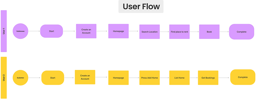
Now, with all of our findings, we were ready to start getting our ideas out of our heads and start designing. Our team sat together and discussed how the app would work, and I provided a user flow so we can have a clearer idea of what functions the application would offer, and with the returned feedback and new ideas, I used Figma to create our first wireframe.
Low-Fidelity Wireframe
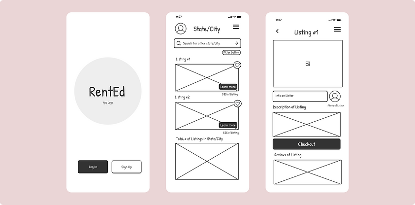.png)
.png)
.png)
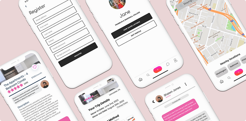
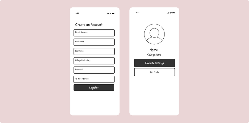
The Prototype
Navigating the Homepage:
After creating an account, you will immediacy be able to search a city or school and see listings near by.
When clicking a listing, you’ll be able to see the following: Name of Listing, Lister and Lister Description, Home Rating, Price, Home Description, Checkout, and Reviews.
Clicking the Listers profile will allow you see their other listings and option to message them.
Booking a Place to Stay:
This is an example of what a chat would look like with a lister and what it would look like to checkout a listing. Having weekly, bi-weekly and monthly payments would make it more cost-accessible for students.
Other Features:
Other features include a search page to see listings in nearby locations to your current address, and to have a personal profile with saved listings.
Prototype Testings/User Usability
To evaluate this prototype, we conducted both remote and in-person usability studies with 50 college students. We are still in-progress of usability testing, reaching out to as many students at universities as possible. We performed a qualitative research where we asked participants of the study to describe their thought process while engaging with the application. Many participants appreciated the design of the application, finding it very easy to use and follow along for their first time engaging with the app.
They suggested that icons on the app should have their sizes increased, and to show the utilities available at the listings under the home description.
Reflections
This was my first project ever working with UX Design, and self-teaching myself how to design on Figma was a hard, but overall great learning experience for me. It was really rewarding to start working in a startup with some of my classmates, and our diverse backgrounds in business, software engineering, and creativity work really well together and we’re able to just pick up new skills and learn from one another along the way. Being able to work with a team that are equally passionate about solving a problem within the college/young adult community has been one of the highlights of this experience so far.
When we initially started out, we thought RentEd would be great as a phone application because of how easy it would be for college students to use, but lately we have been contemplating if it’s better to have RentEd’s MVP be a website, and use student’s experiences with the MVP as a second round of usability changes before we go down the path of sticking to just an app.
During our research process, we learned that a lot of students who live in off-campus housing have strict leases with their colleges/universities that make it difficult for college students to list their college-owned apartments. So, instead of making this a platform for just college students, we are also evaluating our design and thinking of widening our solution to colleges themselves, trying to find solutions that will benefit both the student and the college if they use RentEd’s services.
Next Steps
Towards the end of 2021, our team had big goals of preparing to use our Figma design for the MVP of RentEd. However, we still needed a lot of time to research and consider even simpler designs, because we believed that we added too much to a first version app. Having one CS student in our team filled his plate with a lot of work responsibility, and we had to shrink our designs to something even simpler.
We hope to continue working on RentEd Fall 2022, with an even more straight-forward design without the use of Google Maps, Built-in chats, and in-app purchases as well. We hope that RentEd's MVP would be a platform for students to just list available listings for other students to find and temporarily rent.
As a designer, my next steps is to work on new wireframes and designs for RentEd, and to learn from my first UX design experience for future projects and work.